#PowerBI – Combine visual calculations and numeric parameters to create a dynamic moving average period

With the introduction of visual calculation in the February 2024 release of Power BI desktop (https://powerbi.microsoft.com/en-us/blog/visual-calculations-preview/) – this gives us some new possibilities to add calculations on the individual visual and some new functions gives us some exiciting options.

One example could be to use the MOVINGAVERAGE function (link) to and combine it with numeric range parameter to make it dynamic.

Let me take you through how this can be done

As an example file I have used the datagoblins contoso file sample file that you can download from here (link)

I have added a measure for Sales Value and some time intelligence function to filter the development chart for the selected time intelligence period.

Let’s start by adding a moving average with a visual calculation – If you have enabled the preview feature via options you should see the “New calculation” button enabled in the ribbon.

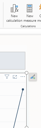
When you click this the Calculation editor will appear

If change the name and click the fx – you can select a template called Moving average

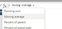
This will add the formula

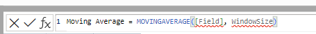
And you can modify it to this

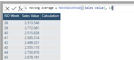
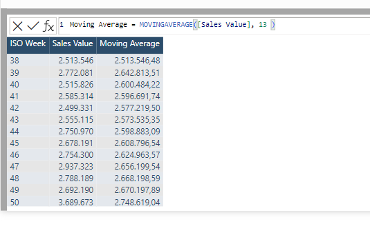
The field refers to the measure you want to calculate the average for and the windowSize refers to the number of rows to include in the calculation. In my example I have week numbers on rows and I want a moving average for the last 13 weeks.

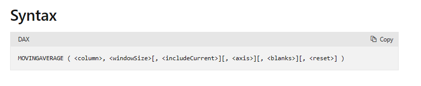
Be aware that the documentation describes the optional arguments as well – click on the image to see the official documentation.

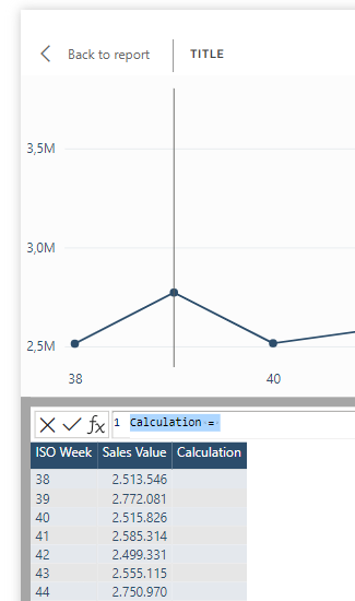
When committing the formula you will see the result

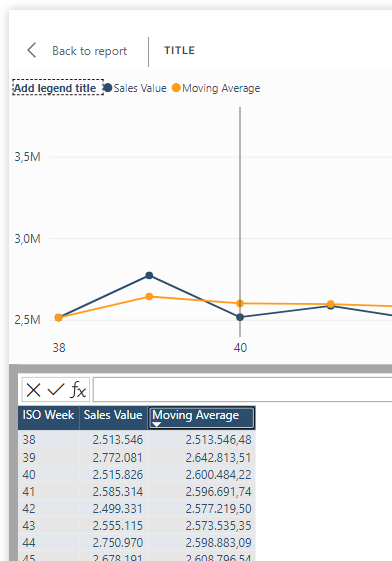
And going back do the report we now have a line showing the moving average for Sales Value for the last 13 weeks … πŸ‘

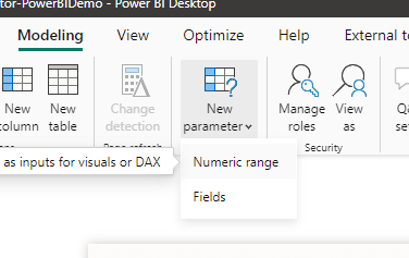
But what if the user wants a little more control over the length of the period ??

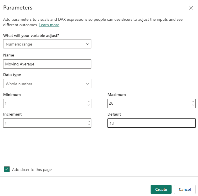
My first thought was – let’s just add a slicer with a numeric range parameter – So I clicked the Numeric range under New Parameter

And created it like this

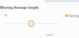
And with some formatting I ended with this slicer

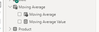
And in the model we can refer to the value of the parameter via created measure “Moving Average Value”

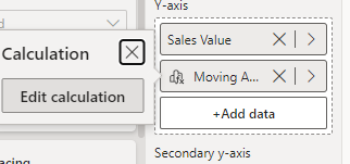
Next step is to modify the visual calculation

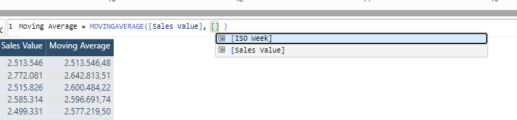
Then I thought lets replace the constant value with the parameter measure value

But in the intellisense I found I couldn’t refer to all measures in the model only the add fields was visible

Okay – lets see if we can cheat – so I added the parameter value field as a tooltip

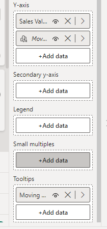
This meant that I was able to refer to it …

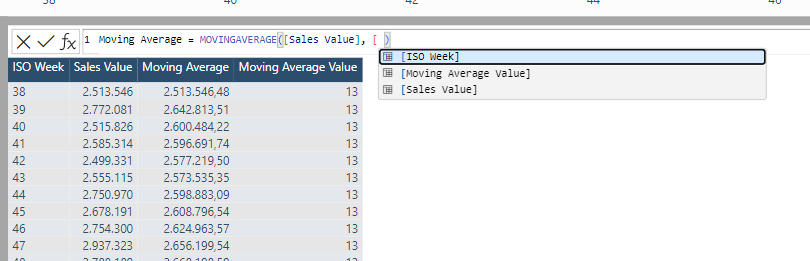
But only to be hit be the constraint in the function that the window size must be a constant value

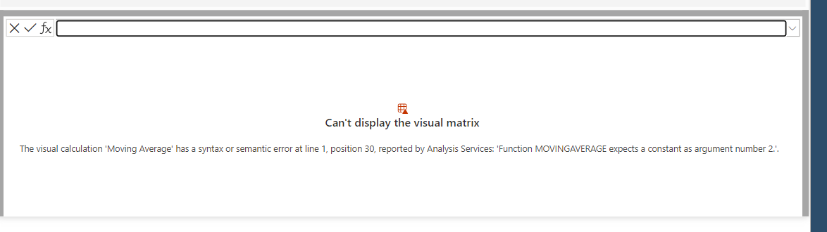
hmmmm… what to do ?? – So I decided to make the solution a bit simpler…

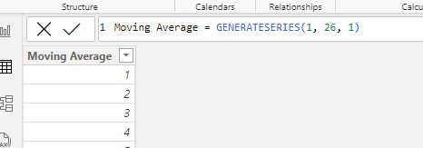
First I changed the parameter table constructor from 1-26

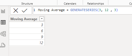
to only 4 different values

And then modified the slicer to the new slicer and added some formatting and placed it on top of the development chart.

And then I modified the visual calculation to

Moving Average = 
SWITCH(
[Moving Average Value],
3, MOVINGAVERAGE([Sales Value], 3),
6, MOVINGAVERAGE([Sales Value], 6),
9, MOVINGAVERAGE([Sales Value], 9),
12, MOVINGAVERAGE([Sales Value], 12),
MOVINGAVERAGE([Sales Value], 12)
)

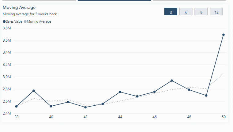
So when ever the user picks another value in the slicer the switch statement will evaluate the current value of the Moving Average Value – and use the appropriate constant value,

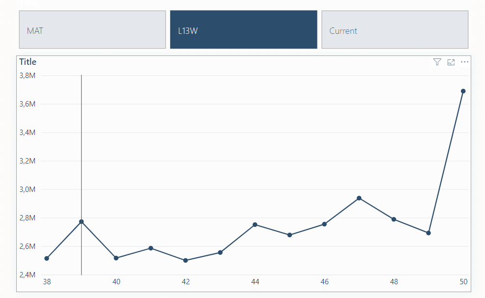
And with some further formatting and subtitle we end up with this

You can download the example file from here.

Let me know if you find this useful and/or give the post a like πŸ™‚

#PowerBI – update your measures without the formula bar

The introduction of the DAX query view (official blogpost) and the new INFO DAX functions (official blogpost) gives us some very possibilities to update our measures without using the formula bar.

We can for instance create a query that shows all the measures that has an error message like this

EVALUATE
VAR _X =INFO.MEASURES()
RETURN
FILTER(_X, [ErrorMessage]<>"")

This will extract all my measures in the open power bi file that contains an error message.

In this case I have a measure that contains an error message telling me that I can’t use a True/False expression to filter a table. Normally you would probably search for the measure and the field list and modify via the formula bar but there is another way and will make it possible to test it before you update it.

Let me show you how πŸ˜€

The INFO.Measures() also returns the expression for the measure

Select the expression and press CTRL+C to copy the expression

Then go to the DAX query and type in DEFINE followed by a line break and then use intellisense to find the Measure and paste the copied expression – this look something like this

As soon as you start to modify the expression of the measure the text “Update model: Overwriting measure” will appear

And if you want to test it before you hit the update model “button” – you can add an EVALUATE statement and see if the measure works as intended.

When you click to update – you will get a warning that tells you that there is no way to Undo it – so be sure πŸ™‚

Hope you this can help you and if you like it – please give the post a like πŸ™‚

#PowerQuery – Get the population (or any other) data from Statistics Denmark into Power BI

It turns out that the blogpost I wrote 10 years ago about getting data from Statistics Denmark into Power BI with Power Query still is being used – 😊 – link.

But as the API has changed a bit since then I was asked to do an update of the blogpost – so here is how you can get the population of Denmark imported into Power BI with Power Query.

The source

Statistics Denmark provides you with a lot of information about Denmark. These data can be accessed via this site – Statistics Denmark (dst.dk). When you manually want to download the data you will find all the tables in Statistikbanken (statbank.dk)  – which provides an interface to setup a report that you then will be able to download in different formats.

In this example, I set up a simple report and you can see the export formats here.

As a Power BI developer we don’t want to do this – we want to automatically retrieve new data – API to the rescue

The Statistics Denmark does provide an API that we can use to extract the data automatically.

Its located here – Databank API – Statistics Denmark (dst.dk)

Let’s extract the Population for Denmark

When we click the button β€œSTART CONSOLE” we get this

We want to retrieve data so pick that under 1) Choose API call

Under 2) Choose settings for call we first need to select whether to do a get or a post call – we can do both but a post call requires a bit more manual code so I will stick to a get call. (If you want to know how to create a post call in Power Query – I can recommend this article from Chris Webb – Chris Webb’s BI Blog: Web Services And POST Requests In Power Query (crossjoin.co.uk) or my own here – Specifying JSON Query in Power Query – Example Statistics Sweden – Erik Svensen – Blog about Power BI, Power Apps, Power Query (wordpress.com).

Next is to specify the table name

In the Table id I have specified β€œFolk1a” – you can find the different table names in Statbank (id highlighted in green)

Next – select the Format β€œCSV” as this is the binary format the API will return to Power Query.

When you click more settings, you can change the delimiter if needed.

Next up we will click the Variable- and value codes and this will give us the opportunity to select what data we want to extract from the source.

You can click the individual items/codes or click on the * to get all elements from the variable.

In this example I have picked all KØN (gender), all ALDER (ages), total for CIVILSTAND (marital status), All – TID (time) and all OMRΓ…DE (regions and municipalities)

Under Other settings I leave it to default but you could change the language to English for instance

Under 3) Call the API with the chosen settings

You can see that a URL with the query is created for you.

You can then click Execute to see the result

OOPS – the API is limited to 1.000.000 cells

So, it’s telling me to extract the data either by using BULK or another streaming format instead.

Go back to 2) Choose setting for call

And select BULK under Streaming.

The URL under 3) will now be changed

And you could try and execute the query once again and the result will be shown after a while.

Copy the URL …. And then

Let’s do it in Power Query

Open Power BI Desktop and click get data and choose Web

Paste the URL into the dialog box and click OK

Very quickly you will get this based on the first 200 rows

If the Query is what you want, then click Load but you should really click Transform Data to control what data is imported to your model – so click Transform Data

And wait a couple of seconds for the preview data to load.

The data contains total lines, text after ages, not a proper date for the time and a few other transformations before we are ready to import the data in to our data model.

I won’t go through each of them but have a look at the file.

You can modify the URL to change what time is imported and make it dynamic depending on what you want imported instead of just all periods.

The API is not the fastest so the appx. 1.2 million rows this selection returns takes a couple of minutes to update.

And then we can start to create explicit DAX measures and visualize our data.

In the demo file I have created this page to create an overview of the change in the population between two different periods in top x municipalities in Denmark.

You can download the demo file here – and just click refresh to get the latest data 😊

Let me know what you think and if you like it give the post a like please.

Stay Queryious !!!

#PowerBI – Control the sorting when using a field parameter selection as value in visual

Just a quick post on how you can control the sort order when using a field parameter as value in a visual in Power BI.

In my scenario I have created a field parameter to choose between showing Sales Value and Sales Units

And now I can use this as the y-axis in a column chart.

And let the user select whether to show Sales Value or Sales Units.

Β 

The column chart only has one field on the x-axis – but if I add more than one field or a hierarchy the sorting won’t work as you might wish for.

As soon as we add another level – the sorting will be default jump to sorting by the level we have drilled too in the visual

Now sorted by chain in alphabetical order

Now we can change it manually so a sort by the current selection of field parameter.

But if we change the field parameter to show Sales Units – the visual will jump back to sorting alphabetically by the selected level on the x-axis.

Β 

This might be the default way of doing it but if you always want the chart to be sorted by a particular measure even though you are showing another measure then you can use this workaround. You should of course inform the user about the chosen sort order for instance in the subtitle or similar.

WORKAROUND

Β 

Let’s say I always want to sort the chart after Sales Value – then I can add the measure as a tooltip to the visual.

Β 

All the different fields you add as tooltips can also be used to sort the visual by

Β 

And now the sorting will always happen on the selected tooltip value instead of the field on the x-axis.

Here we show the Sales Value

Β 

Remember – This workaround is only relevant when you have more than one field on the x-axis – but we typically do for drilling up and down so hopefully this little tip can help you two.

Β 

Β 

Document your #powerbi model with #chatGPT and a #tabulareditor script and browse it in your model

Inspired by Darrens Gosbell’s excellent blog post – Automatically generating measure descriptions for Power BI and Analysis Services with ChatGPT and Tabular Editor – Random Procrastination (gosbell.com) – and my session at SQLBits 2023 where I showed how to call the chatGPT from within Power Query and how you can use the New chat (openai.com) – to describe your M code.

I thought it would be nice if I could add this as a description to my tables in Power BI model.

How hard can that be πŸ™‚

Well, it turns out that we are not allowed to modify the table object via the Tabular #ditor and this includes adding a description to the table

So, if I created a script that added a description – it worked fine but returning to the desktop I was asked to refresh the queries and the descriptions where removed by Power BI desktop –

Well, what is supported as write operations to a model?

Calculation groups is supported – hmmm… could I use this and then actually create a calculation group with a calculation item for each of the tables in my model – that would also mean that I could create a table in my report and expose the descriptions in a report page instead of the description should be hidden away on the tooltip of a table in the field list – This could actually be quite awesome!

C# Script here we go

I know very little about how to write C# code so Darrens example and the documentation of Tabular editor was a big help and please bear in mind that I am a C# novice when reading my code

The steps needed to this is as follows (I have used Tabular Editor 3 but it should be possible to us the free version of Tabular Editor as well

Step 1 – Open your Power BI desktop file and find the external tool ribbon and click the Tabular Editor

Step 2 – Add a Calculation Group called “Documentation”

Step 3 – Choose to create a New C# Script

Step 3 – Use the following script and run it

#r "System.Net.Http"
using System.Net.Http;
using System.Text;
using Newtonsoft.Json.Linq;

// You need to signin to https://platform.openai.com/ and create an API key for your profile then paste that key 
// into the apiKey constant below
const string apiKey = "<YOUR_API_KEY>";
const string uri = "https://api.openai.com/v1/completions";
const string question = "Please describe this power query code for me:\n\n";

using (var client = new HttpClient()) {
    client.DefaultRequestHeaders.Clear();
    client.DefaultRequestHeaders.Add("Authorization", "Bearer " + apiKey);

    foreach (var t in Model.Tables)
    {
        
        foreach ( var p in t.Partitions)
        {
            // Only uncomment the following when running from the command line or the script will 
            // show a popup after each measure
            //
            //var body = new requestBody() { prompt = question + m.Expression   };
                string _type = Convert.ToString(p.SourceType);
                string _exp = Convert.ToString(p.Expression);
        if ( _type == "M" )
            {var body = 
                "{ \"prompt\": " + JsonConvert.SerializeObject( question + p.Expression ) + 
                ",\"model\": \"text-davinci-003\" " +
                ",\"temperature\": 1 " +
                ",\"max_tokens\": 256 " +
                ",\"stop\": \".\" }";

            var res = client.PostAsync(uri, new StringContent(body, Encoding.UTF8,"application/json"));
            //res.Result.EnsureSuccessStatusCode();
            var result = res.Result.Content.ReadAsStringAsync().Result;
            var obj = JObject.Parse(result);
            var desc = obj["choices"][0]["text"].ToString().Trim(); 
          
            //Reference to your calculation group that should hold the calculation Items
            var x =(Model.Tables["Documentation"] as CalculationGroupTable).CalculationItems[t.Name];
            
            //deletes the old version
            x.Delete();

            var calculationItem1 = (Model.Tables["Documentation"] as CalculationGroupTable).AddCalculationItem();
            
            //removes any quotes in the chatGPT description
            var s = desc.Replace("\"", "");

            calculationItem1.Expression = "\"" +  s + "\"";
            calculationItem1.Name = t.Name;
            
            //Info("Processing " + t.Name) ;
            
            }
        }

    }
}

This will create a calculation item for each of your Power Query table and add a Expression that contains the chatGPT description of your M code

Example of one of the tables

Step 4 – Save the changes back to your model and you will be prompted to refresh your calculation group

Step 5 – Add a table where you take the Calculation group name and a measure that I call Query description – the value of this measure will in the table be changed to the expression of the calculation item.

https://tenor.com/embed.js

We could use the same method to document our DAX measures and put that into a calculation group as well – thereby documenting our full model and exposing the information directly in the report and not just in the tooltips of the fields.

I will try to find time to do a blog post on this as well.

Let me know in the comments if you find this useful – would very much like to hear from you.

Connect your #PowerBI desktop model to #Tableau Desktop via External Tools in PowerBI

I recently created an external tool to PowerBI desktop that connects your Power BI desktop model to Excel (https://eriksvensen.wordpress.com/2020/07/27/powerbi-external-tool-to-connect-excel-to-the-current-pbix-file/) and then I thought – could we also have a need for an external tool that could open the desktop model in Tableau desktop.

So, I downloaded a trial version of the Tableau Desktop to see what is possible.

And sure, enough Tableau can connect to Microsoft Analysis Services and therefor also the localhost port that Power BI Desktop uses.

We can also save a data source as a local data source file in Tableau

Which gives us a file with a tds extension (Tableau Data Source)

When opening the file in Notepad we can see the connection string and some extra data about metadata-records.

It turns out that the tds file does not need all the meta data record information – so I cleaned the tds file to contain

Opening this file from the explorer will open a new Tableau Desktop file with the connection to the specified model/database/server.

The external tool

Knowing this I could create an external tool the same way as my Excel connector.

First create a PowerShell

OBS – in order to run a powershell script on your pc you need to have to set the execution policy – https://go.microsoft.com/fwlink/?linkid=135170

The PowerShell script

Function ET-TableauDesktopODCConnection
{  

	[CmdletBinding()]
    param
    (
        [Parameter(Mandatory = $false)]        
		[string]
        $port,
        [Parameter(Mandatory = $false)]        
		[string]
        $database,
        [Parameter(Mandatory = $false)]        
		[string]
        $path	
    )
    
        $tdsXml = "<?xml version='1.0' encoding='utf-8' ?>
<datasource formatted-name='LocalPowerBIDesktopFile' inline='true' source-platform='win' version='18.1' xmlns:user='http://www.tableausoftware.com/xml/user'>
  <document-format-change-manifest>
    <_.fcp.SchemaViewerObjectModel.true...SchemaViewerObjectModel />
  </document-format-change-manifest>
  <connection authentication='sspi' class='msolap' convert-to-extract-prompted='no' dbname='$database' filename='' server='$port' tablename='Model'>
</connection>
</datasource>"   
                
        #the location of the odc file to be opened
        $tdsFile = "$path\tableauconnector.tds"

        $tdsXml | Out-File $tdsFile -Force	

        Invoke-Item $tdsFile

}

ET-TableauDesktopODCConnection -port $args[0] -database $args[1] -path "C:\temp"

The script simply creates a tableauconnectort.tds file and stores it in C:\temp – and the xml content in the file is dynamically referenced as arg(0) and arg(1) when the external tool is called from Power BI Desktop.

Save the script in C:\temp and call it ConnectToTableau.ps1.

The OpenInTableau.pbitool.json file

Next step was to create a pbitool.json file and store it in C:\Program Files (x86)\Common Files\Microsoft Shared\Power BI Desktop\External Tools

{
  "version": "1.0",
  "name": "Open In Tableau",
  "description": "Open connection to desktop model in Tableau ",
  "path": "C:/Windows/System32/WindowsPowerShell/v1.0/powershell.exe",
  "arguments": "C:/temp/ConnectToTableau.ps1 \"%server%\" \"%database%\"",
  "iconData": "data:image/png;base64,iVBORw0KGgoAAAANSUhEUgAAAJAAAACQCAYAAADnRuK4AAAABmJLR0QA/wD/AP+gvaeTAAADRklEQVR4nO3dv27TUBiH4WPEitSRS+iCurO0GzdRiS5sXRhAXZhYEAxd2LoUiZtgaxb2iqWXwFiJCzgsqPRPrMb5Jc1x/TxbqgSi5O2xE3+uSwGAUeo2/QRac3R8cla6bvfqB7XOPr19s7e5Z9S2J5t+AoybgIgIiIiAiAiIiICICIiIgIgIiIiAiEziUMbR8cnZovetXbfTlbJ1dbuUy67W80UfP7XDHk83/QQexPVjW/fd9e7trSGPnxqbMCICItLEJqyeljrv593BivbRap0tfNdwH2hVDj58mfuanH5819R+axMBrduQHdvb80BdredT2zEewiaMiICICIiIgIgIiIiAiAiIiICICIiIgIhM4lDGEA5bDGMFIiIgIgIiIiAiAiISTbf1TRK2ZmWTjQvomyRszaomG61ARAREREBEBEREQESaOMdo7eeFjdBYzguzAhEREBHjHP/8fv/i3i8An3/+1dTmowVWICICIiIgIgIiIiAiAiIiICICIiIgIgIiIiAiSx8Lc3Xjcdk/nJ2VWv+/X103+/51dy/9d61ARAREpIlxjilPHvZpbfKwjxWIiICICIiIgIgIiEgTn8KGWmQAfiz/79gH9a1ARG7UP5arG29qBVqHZAXaP5ydDbj7Tqn16v0qXXdZSln4/eo77HFzE+bqxuNy/djW8MdulVLi98smjIiAiNzchI3w6saT1nULv18l3AfqfQrLPnCT80B2ooczD0STRvlF4jp+a/11juVYgYgIiIiAiAiIiICINPEp7Of29txPQC8vLib7qefZq29zX5M/P1439ZpYgYgIiMjSmzCnMY/LKg5bzGMFIiIgIgIiIiAiAiIiICICIiIgIgIiIiAiAiLSxDhHCwzML8cKRERARKJlu2+SsDUPOdnYN0nYmlVNNlqBiAiIiICICIiIgIg08eWZ88Lucl4YkyAgIgIiIiAiAiJinOOWdf0108fKCkREQEQERERARAREREBEBEREQEQERERARCZxKGPw1Y1v3R7y+Kkd9mgioLVPHjZwdeOhWps87GMTRkRARJrYhK1dA1c3fqxGsZ19SOaBhrEJIyIgIgIiIiAiAiIiICICIiIgIgIiIiAAAAAYjb8VJdQbiRXyOAAAAABJRU5ErkJggg=="
}

Test it

Now restart your Power BI desktop and the external tool should be visible in the ribbon

Then open a pbix file with a model and hit the button.

A PowerShell screen will shortly be visible and then Tableau opens the tds file and now we have a new tableau book with a connection to active power bi desktop datamodel.

And we can start to do visualizations that are not yet supported in Power BI –

How can you try it

You can download the files needed from my github repository – link

Feedback

Let me know what you think and if possible share some of the viz that you make.

Using Power Query and Power Map to visualize public data of the windmills in denmark

While preparing a training session for a customer within the Windmill industry I found public data that lists all the windmills in Denmark with their size and location.

The data can be found here – http://www.ens.dk/info/tal-kort/statistik-noegletal/oversigt-energisektoren/stamdataregister-vindmoller

So I decided to see what Power BI could do with this dataset.

The data

The file with the latest data (http://www.ens.dk/sites/ens.dk/files/byggeri/anlaegprodtilnettet.xls is named the same way and is structured in a way that makes it easy to make custom analysis and visualisations.

So first tool to use in the Power BI stack…

Power Query to the rescue

First – switch to the Power Query tab and choose to load data from File and Excel File and paste the address to the file in the file open – it does take some time but it will work.

And Power Query will open and list the tables that exists in the file

The data we are interested in starts at row 18 and contains a lot of columns that we aren’t interested in.

And there is also some formatting of columns from text to numbers etc.

Here is the total list of steps shown

Create a Power Query function to create Latitude and Longitude

The data file has doesn’t contain Latitude or longitude but the coordinates is listed with the “European Terrestrial Reference System” – so I had to find a way to convert the values into Latitude and longitude.

The Danish Geodata Agency provides a free webservice that can do the conversion for us – http://geo.oiorest.dk/documentation/api/koordinat.aspx – examples.

So for instance the first wind mill is located at

http://geo.oiorest.dk/wgs84.html?etrs89=6171175,720898.4

And inspired by Rafael Salas – blog post – http://www.rafael-salas.com/2013/08/power-query-creating-function-to.html – I decided to create a Power Query function to do the calculation.

So I created a blank Query and added the following query

The function takes two arguments the east and north coordinates, and uses those coordinates to get and XML table from the Web service. As I run with a comma as decimal separator on due to my Danish regional settings I have to replace the comma with a dot as the web service requires the decimal separator to be a dot.

The result is loaded into a table with the “bredde” – latitude and “LΓ¦ngde” – longitude

And the function returns both of these columns.

Then I can use that function in my first query by adding a Custom Column.

And expand that to get both latitude and longitude as columns in my query.

And voila the custom calculated columns.

Then some number formatting of some columns and renaming to English heading and we are ready to send the data to Excel

The data back in Excel

Returning the query to Excel will then give me the list of all 5.126 running windmills in Denmark per September 2013.

Pretty awesome – it does take about 2-3 minutes for it to update/lookup all the geo location – but only one isn’t matched and that is due to an empty row.

Using Power Map to visualize the data

With the data nicely washed and geotagged we can use Power Map to visualize the data.

Power Map’s first guess on the geomapping is actually very good. The “Kommune” is set to county – which is correct and because I named the columns Latitude and Longitude these are automatically also linked correct.

With the Geography properly matched we can move “Next” to visualize the data.

So for instance the KWH by Supplier

Or the KWH by Region/County

Or the world biggest sea wind mill park

Or a heatmap

This is so much fun and finally let make a video of the development over time.

Power map video

Power map also enables us to create a timeline and play the timeline. The data has the date of when the windmill was established so we can use that date to visualize how the windmills have evolved over time.

So by adding the established field to the Timeline – power map can visualize the development over time.

This can be created as a video.

Creating the 45 sec video at the medium format took about 10 minutes to create – so be patient.

Here is a link to the video – http://sdrv.ms/17cBIrx

The file

You can download the example file – here

Comments please

You are more than welcome to add a comment whether you find this cool or not J