Use hidden measures and members from #PowerBI dataset in an Excel Pivot table

When you connect to a Power BI Dataset from Power BI desktop you might have noticed that you can see and use hidden measures and columns in the dataset.

But the hidden fields cannot be seen if you browse the dataset in Excel.

But that does not mean that you cannot use the fields in Excel – and here is how you can do it.

Using VBA

You can use VBA by creating a macro

The code will add the field AddressLine1 from the DImReseller dimension as a Rowfield if the active cell contains a pivotable.

Sub AddField()
    Dim pv As PivotTable
        Set pv = ActiveCell.PivotTable
        pv.CubeFields("[DimReseller].[AddressLine1]").Orientation = xlRowField
End Sub

If you want to add a measure/value to the pivotable you need to set change the Orientation property to xlDataFields

This means that we now have added two hidden fields from the dataset

Add hidden measures using OLAP Tools

You can also add hidden measures using the OLAP Tools and MDX Calculated Measure

Simply create a new calculated measure by referencing the hidden measure in the MDX

This will add a calculated Measure to the measure group you selected

And you can add that to your pivotable

Referencing hidden items using CUBE functions

Notice that you can also reference the hidden measures using CUBE functions

Simply specify the name of the measure as the member expression in this case as “[Measures].[Sales Profit]”

You can also refer to members from hidden fields using the CUBEMEMBER functions

Hope this can help you too.

Power On!

Be aware of this feature when publishing Excel power pivot models to SharePoint

When creating Power Pivot models in Excel and you hide all the columns in your fact table/-s – Excel will show a βˆ‘ next to the table name and show these first in the PivotTable field list in Excel.

This is a good way to help the users of your models to navigate in your model – but if you plan to browse the models via SharePoint – Excel Services has a very bad side effect…

The fact table cannot be accessed via the PivotTable Fields selector…..

If you unhide a field in the fact table

The table will now show as table in the field list in Excel.

And when you browse your model in SharePoint the Facts can now be added to the pivot table in the browser.

So if you plan to publish your models on SharePoint – do not hide all the columns in the fact tables unless you do not want the users to be able to modify the values in the pivot tables.

Sort the Power Pivot measures (and fields) in the PivotTable Fields

When designing your pivot tables based on a Power Pivot model you typically add fields and measures continuously, and in the measure list they will by default list then be sorted by the order you have created them – and that is not always the best.

Luckily you can set sort order for the Pivot table fields – by clicking the tool button just above the fields list

By default is set to “Sort in Data Source Order” – but you can change that to A-Z – and then all measures – and fields in dimensions will be sort alphabetically making it somewhat easier to find.

Β 

Use slicers to select the facts in a pivot chart

In one of my previous posts link – I described how you can create a dynamic pivot chart in Excel 2013 – but it did require VBA to change the fact.

But inspired by Rob Collie – link@powerpivotpro – and several readings about the DAX SWITCH function – I decided to see if I could use slicers to create a dynamic chart using Slicers.

So first I created a power pivot model based on Adventure Works DW, and created some facts

Sales Value

Sales Value LY

Sales Units

Sales Units LY

Average Price

And the user should now be able to select from a slicer which of these should be plotted in a development chart.

So I start by creating a table in Excel with the facts

Adds the table to the data model in the workbook

And create a measure called

Selected fact:=min(Table1[FactID])

This will be used in another fact which is the one I will use in the pivottable/chart.

So when I create a pivottable the Selected fact will return the ID of the fact when the Fact names are placed on rows or columns.


Then I create a dynamic fact calculation

Fact to plot:=SWITCH([Selected fact];1;[Sales Amount];2;[Sales Amout LY];3;[Sales Units];4;[Sales Units LY];5;[Average Price])

So adding the fact to the pivottable it looks like this – with the correct value under each fact – DAX magic πŸ™‚

You will get a warning about missing relationship but you can ignore this.

So Insert a slicer with the Fact as the slicer


And now I can filter the table with the slicer


And now you can create a pivot chart based on the pivot table and add a slicer for the year and other dimensions if needed..


OBS – you cannot use this technique with the new pivotchart in Excel 2013 but you have to have a pivottable behind the chart – but you can put that on a hidden sheet if needed.

You can download the example file from here – Download

How to get selected items in a slicer without VBA

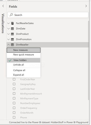
Slicers is an essential tool in Excel when working with power pivot pivot tables (and “normal/old” pivot tables). But when connecting the same slicers to multiple pivot tables and perhaps place all your slicers on a separate sheet you have to be able to show what your model users have selected in the slicers when they look at the pivot table.

You can create VBA code to read the selected items from the slicer object, but this code cannot be run if you publish your model for use in Excel Web App on SharePoint.

So to avoid code I have created formula to generate a text string indicated what the user selected in a slicer.

Step 1 Create the data for a powerpivot model

Β 

First I create some sample data to use in a powerpivot model.

The Store =INT(RANDBETWEEN(1;50))

The date =TODAY()-RANDBETWEEN(1;100)

The Product =RANDBETWEEN(1;10)

The Sales Value =RANDBETWEEN(100;4000)

And then copy these formulas to generate a random number of rows.

Step 2 Create a linked table to PowerPivot

Β 

Select PowerPivot and click Create Linked Table

This will link the data to PowerPivot so we can build a simple model.

In order to create a year and month slicer – I add to calculated columns.

Year: =Year([Date])

Month: =Month[Date])

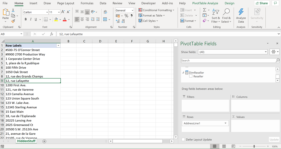
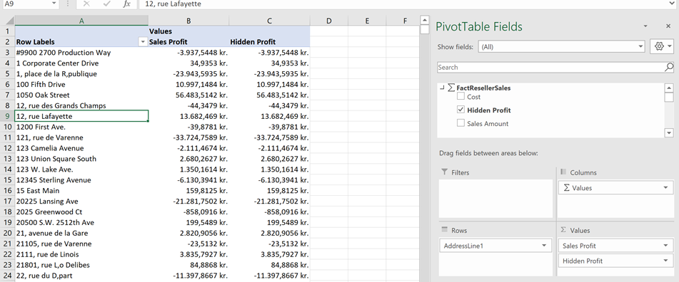
Step 3 Create a pivottable with slicers

Β 

Then I setup a pivot table with slicers that might look like this.

Β 

Step 4 Let’s calculate the selected items in the Store Slicer

Β 

A slicer in Excel has some settings in which you can identify the slicer in your formulas.

Β 

In this case our slicer “Store” is called “Slicer_Store”.

We can use this name in our formulas.

In order to get the number of selected items in a slicer we use the function – CUBESETCOUNT

Β 

The formula =CUBESETCOUNT(Slicer_Store) will return 1 – as all items is selected

Β 

Β 

When you select three items it will return three.

Next function to use is CUBERANKEDMEMBER-

Β 

CUBERANKEDMEMBER can return a member in a set by specifying it rank in the set.

Using the name of the slicer – the name will return a set of selected items in slicer !!!!!!!!

=CUBERANKEDMEMBER(“PowerPivot Data”;Slicer_Store;1)

So this formula will return the first selected item in the slicer and if all items is selected it will return All.

Β 

Step 5 Lets create a label for the selected items

Β 

A slicer can contain many items and I don’t want to create a very long label, I chose to let the label contain the first 10 selected items and if more than 10 is selected – the label should return the text “More than 10 selected”

Β 

In column M there is a rank number from 1 to 10.

In column N next to the rank I create a formula that retrieves the ranked member in the slicer.

=IF(M14<=$N$12;CUBERANKEDMEMBER(“PowerPivot Data”;Slicer_Store;M14);””)

The formula test if the rank is lower or equal to the number of selected items in the slicer (calculated with CUBESETCOUNT), if it is – it will return the ranked member in the Set – otherwise it will return blank text.

In column O I create formulas to generate the label.

First formula just takes the first member

=N14

Second item

=O14&IF(N15<>””;”, “&N15;””)

Tests whether the N columns returns an result – if it does it will concatenate the two labels split by a comma.

This formula is copied down for all rank numbers.

And finally a formula to create the complete list or if more than 10 is selected

=IF(N12>10;”More than 10 selected”;O23)

The cell is then named “StoreSelected” and then you can refer via the name on any of your sheets in the workbook.

Try it

Β 

You can download the example here – Link (open the file in Excel – not in Excel web app as powerpivot isn’t supported )

Find the member key in Excel

I use Excel as my main OLAP cube browser and sometimes need to retrieve the member key for a Dimension member that is visible in the Pivot table.

None of the Cube functions in Excel (CUBEVALUE, CUBEMEMBER etc.) is able to give me the information even though when I convert the pivot table to formulas it actually uses the member key in the formula – so how do I get to that information

In order to retrieve the member key I created a function in VBA in my personal macro workbook.

Function GetSourceName(Pivotcell As Range) As String

Dim pvi As PivotItem

‘In order to catch if the reference pivot cell is not within a pivottable

On Error Resume Next

Set pvi = Pivotcell.PivotItem

On Error GoTo 0

If Not pvi Is Nothing Then

GetSourceName = Pivotcell.PivotItem.SourceName

Else

GetSourceName = “Range is not a pivotitem”

End If

End Function

This gives me the possibility to retrieve the member keys in a formula next to the pivot table.

This helps me a lot when creating custom mdx’s in Query design or report designer in BIDS, and also when setting up Report subscriptions.

Project Crescent – Visualizing data

I have just played around with the latest tool in the MS Bi Stack – Project Crescent.

This is a visualization tool to present PowerPivot data either from Excel PowerPivot workbooks or from a tabular model stored on the SQL Server Analysis services – Denali.

So I decided to look for some data and “Danmarks Statistik” has a lot of it (http://www.dst.dk).

I downloaded a table containing the information for different work sections and number for

  • Hours worked
  • Jobs
  • Employees
  • Total Salery

I imported that into Excel 2010 and did some data preparation in order to prepare it for use in PowerPivot.

This data and supporting tables for areas and periods where then linked to the PowerPivot model.

And then I created a sample dashboard in Excel using the slicers, pivot table and a pivot chart.

Activating Crescent

This workbook is then saved to SharePoint, where integration with SQL Server Denali was enabled.

This gave me the opportunity to create a Crescent Report

Then I made this report

And the cool stuff is the time line in the scatter chart..

Check this video out J

http://youtu.be/UiODGz-o7R8

Analyze your inbox with PowerPivot

Inspired by an Microsoft Excel add-in where you can analyze your calendar items with Excel’s new PowerPivot tool, I decided to have a look at my inbox with Excel and PowerPivot.

And here is the interesting results.

The model reads all items in my inbox root folder (with currently over 1.800 items – been a while since I read about inbox Zero), and imports subject, sender, sender email address, size of the mail and number of attachments.

This data is inserted into a sheet in the workbook in a table. This table is then linked to PowerPivot window.

And in order to make some date grouping and calculate whether the mail was from a collegaue or external mail, I added some calculated columns in the PowerPivot model.

Based on the PowerPivot model I then created this overview / dashboard of my inbox.

I can see that

  • I receive most e-mail on Wednesdays
  • About 75 % of my mail is over 1 month old
  • 10 senders are responsible for 53 % of my big inbox and 33 % of all mails
  • I can see that 51 % percent of the Mb in my mail box comes from my colleagues meaning that they must learn how to insert links to files in their emails instead and we can save a lot of space on our mail server.

And the last interesting thing – my colleagues apparently eat around 12:00 and put their kids to bed at 20:00

If you want to try this on your own inbox, please send me a comment and I will send you the model. (Requires Excel 2010)