
In one of my previous posts link – I described how you can create a dynamic pivot chart in Excel 2013 – but it did require VBA to change the fact.
But inspired by Rob Collie – link – @powerpivotpro – and several readings about the DAX SWITCH function – I decided to see if I could use slicers to create a dynamic chart using Slicers.
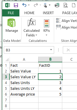
So first I created a power pivot model based on Adventure Works DW, and created some facts
Sales Value
Sales Value LY
Sales Units
Sales Units LY
Average Price
And the user should now be able to select from a slicer which of these should be plotted in a development chart.
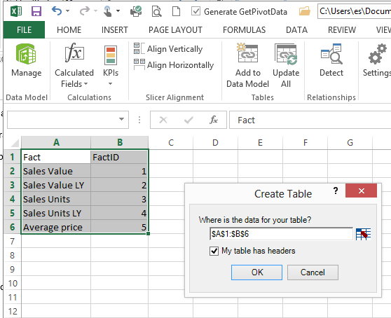
So I start by creating a table in Excel with the facts
Adds the table to the data model in the workbook
And create a measure called
Selected fact:=min(Table1[FactID])
This will be used in another fact which is the one I will use in the pivottable/chart.
So when I create a pivottable the Selected fact will return the ID of the fact when the Fact names are placed on rows or columns.
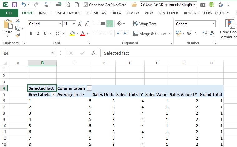
Then I create a dynamic fact calculation
Fact to plot:=SWITCH([Selected fact];1;[Sales Amount];2;[Sales Amout LY];3;[Sales Units];4;[Sales Units LY];5;[Average Price])
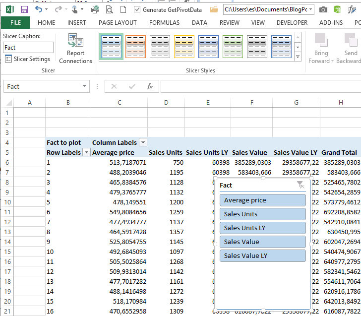
So adding the fact to the pivottable it looks like this – with the correct value under each fact – DAX magic 🙂
You will get a warning about missing relationship but you can ignore this.
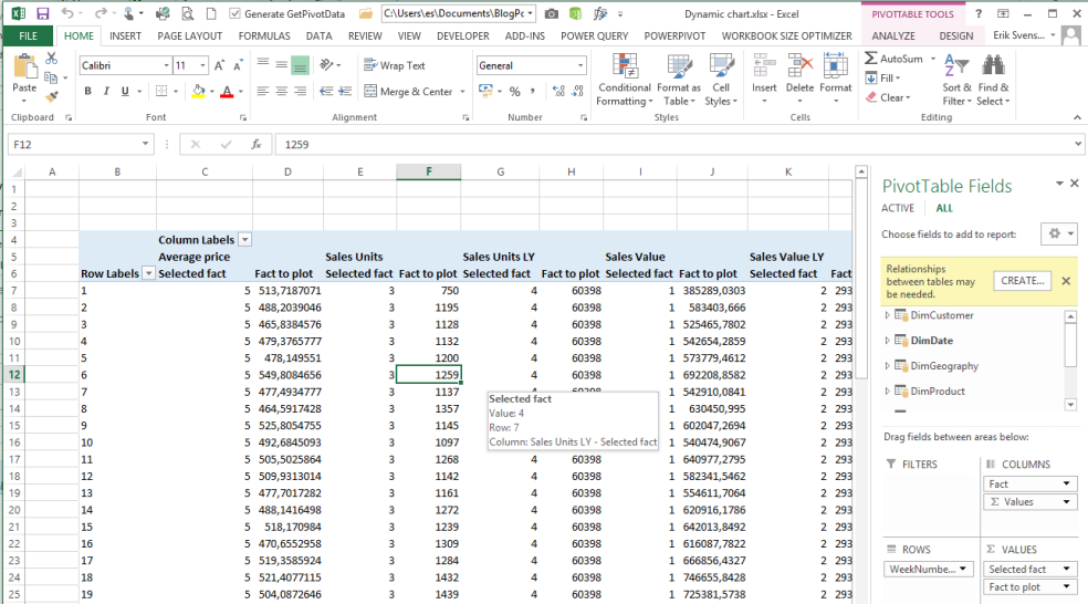
So Insert a slicer with the Fact as the slicer
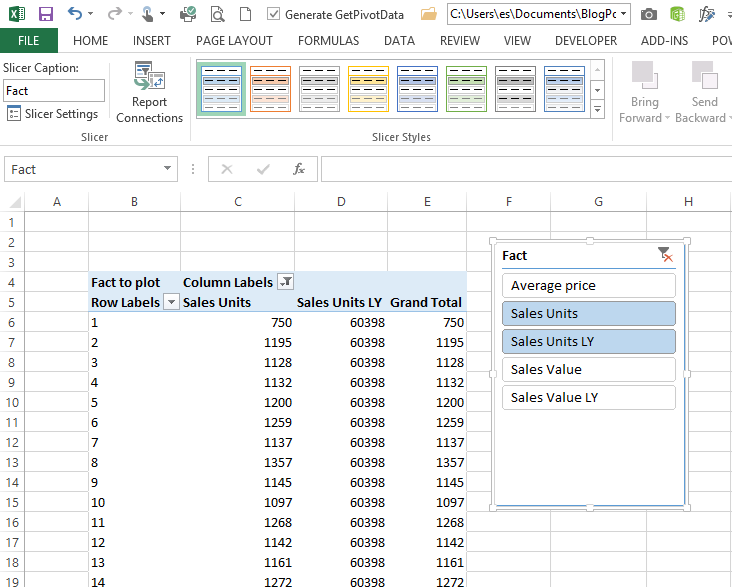
And now I can filter the table with the slicer
And now you can create a pivot chart based on the pivot table and add a slicer for the year and other dimensions if needed..
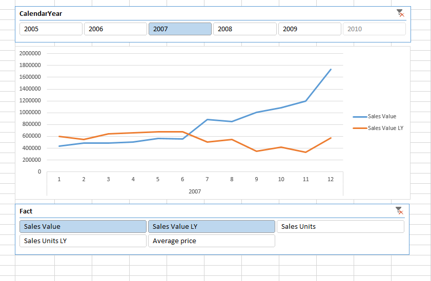
OBS – you cannot use this technique with the new pivotchart in Excel 2013 but you have to have a pivottable behind the chart – but you can put that on a hidden sheet if needed.
You can download the example file from here – Download

This technique is EXACTLY what I’ve been looking for! Of course, there’s a catch: it relies on SWITCH, which is not available in PowerPivot v1. Thank you, Erik!
In v1 you have to use the famous IF function instead and beware of performance issues if you are working with large datasets.
I have a similar problem to the above except that I have one column that needs appear as the Legend/Series in a line chart and each of the values needs to be displayed as separate series and not aggregate together when all of them are selected by a slicer. Is there an approach for something like this?
Here is a link to the chart: http://www.nycourts.gov/surveys/cwcip/metricchart.jpg
Hi Paul,
I am not able to reproduce the issue – if you have the slicer of the field placed as the legend it will not do an aggerate …
You are more than when welcome to send me an example file and I will have a look
BR
Erik